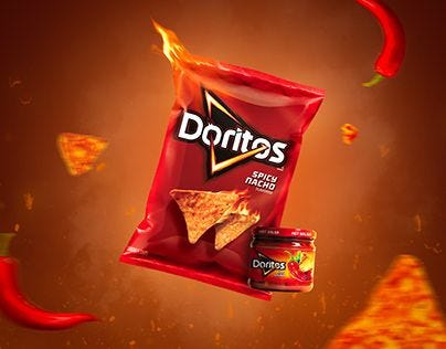
Igniting Flavors Through Colors: A Dive into Doritos’ Fiery Red & Orange Branding
“Whispering tales of adventurous flavor journeys with every vibrant hue, Doritos crafts a silent yet powerfully zesty dialogue between the brand and its consumers.”

A Vibrant Whisper of Flavors
In the bustling aisles of supermarkets, amidst a sea of myriad colors and brands, the fiery spectacle of Doritos’ red and orange branding doesn’t just catch your eye — it speaks to you. It’s a vibrant whisper, promising an explosion of flavors, and an adventurous culinary journey that begins with the eyes, long before the first chip crunches between your teeth.
For those embarking on a journey to understand color, Doritos presents a masterclass in how hues can transcend mere visual appeal, becoming a silent yet potent communicator of a brand’s essence and promise.
The Fiery Palette: More Than Just Colors
Doritos, with its iconic red and orange, doesn’t merely offer a snack; it extends an invitation to a sensory adventure where visual and gustatory experiences meld seamlessly. These colors are meticulously chosen, each a mirror reflecting the flavors within.
The red, symbolizing heat, intensity, and passion, subtly alludes to the bold and spicy flavors, while the orange, synonymous with vitality and joy, promises a lively and zesty experience. Together, they paint not just the packaging, but also the expectation of a bold, exhilarating flavor journey.

Color Psychology: A Subtle Nudge to the Palate
Dive deeper into the realm of color psychology, and you’ll find that Doritos leverages the subconscious influences of red and orange to convey its brand message without uttering a single word. Red, a color that naturally evokes appetite and excitement, subtly nudges the consumer towards an impending thrilling experience.
In contrast, orange, with its friendly and vibrant aura, assures that while the adventure is bold, it remains delightfully approachable. This strategic color curation crafts a non-verbal, yet profoundly effective dialogue between the brand and its consumers.
Crafting a Symphony: Aligning Color and Flavor
The brand identity of Doritos is akin to a symphony where color and flavor create a harmonious melody that resonates with the adventurous spirit of its consumers. Doritos doesn’t just sell chips; it sells experiences, moments, and a dash of daring adventure in every bite.
The vibrant red and orange are not merely colors; they are a commitment, a promise of a flavor escapade that is unmistakably Doritos. This alignment of visual and flavor narratives crafts a brand identity that is not just coherent but irresistibly alluring.
Consistency in Color: An Unwavering Promise
Consistency in Doritos’ color branding plays a pivotal role in establishing consumer trust and brand recognition. The fiery red and orange, whether on a supermarket shelf or a TV commercial, are unmistakably Doritos, acting as a visual signature synonymous with a promise of quality and a burst of flavors.
This consistency not only strengthens brand recall but also reassures consumers of the unwavering commitment to delivering the bold and zesty flavors that Doritos is celebrated for.
Conclusion: Vibrant Branding as a Masterstroke
In the competitive snack realm, Doritos triumphs by crafting a brand narrative that is as vibrant, bold, and daring as its color palette. The fiery red and orange are not mere hues; they are the visual embodiment of every flavor explosion contained within the packaging.
Through a masterful blend of color psychology and strategic branding, Doritos doesn’t just occupy a space on the shelf; it commands attention, promising every consumer a ticket to a flavor adventure that is audaciously bold and excitingly unpredictable.


